Most businesses don’t wake up one morning desperate for a shiny new website.
Usually, it starts with frustration - the enquiries have slowed down.
The business has evolved but the website still talks like it’s 2019. The messaging feels clunky. Competitors that you were never worried about before, suddenly look sharper.
Internally, everyone’s avoiding sending people to the homepage because it just doesn’t represent the business anymore and the conversation starts, 'We need a new website'.
Sometimes you do, but in my experience a lot of website redesigns focus far too much on making things look prettier but nowhere near enough on making them work better.
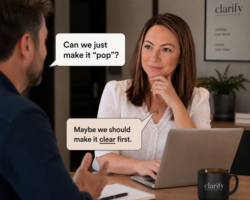
I'll be straight here - a new font, some animations and a slick video won’t magically fix confusing messaging, poor positioning or a website that leaves visitors wondering what you actually do.
The website itself often isn’t the real problem - clarity is. Most websites try to say too much; too many services, too many menu options, too much jargon and often, too many internal opinions stitched together over the years.
The end result usually means the customer lands on the site and has absolutely no idea where they’re meant to go next.
You’ve only got a few seconds to explain what you do, who you help, and why it matters to them. If that’s not obvious quickly, people leave.
That’s why we use a lot of StoryBrand thinking when approaching website projects, so many businesses say 'we’ve been established since...', 'we’re industry leaders…', 'we’re passionate about…' but your customer doesn’t care about your history - yet.
They care about whether you understand their problem. Your website should make the customer feel seen, understood and reassured that they’re in the right place. You’re there to show them (or guide them to use StoryBrand terminology) that you solve something frustrating, expensive, stressful or time-consuming.
A good redesign isn’t really about design first, it’s about positioning. It’s about understanding: who you actually want to attract, what they’re struggling with, what questions they have before enquiring, and what’s currently stopping them from taking action. Then building the website around that - not around what the internal team thinks 'sounds good'.
Clear headlines, simple navigation, obvious calls to action, proof points, testimonials, useful resources, and content that answers questions instead of just filling space. So before you jump into the fun bits, think about:
- What's this website supposed to do?
- Are you trying to generate more enquiries or just modernise the brand?
- Who are you trying to attract now? Has your audience changed?
- What makes us different from competitors?
- What questions do customers always ask before buying?
- What pages are people actually visiting?
- Are we giving visitors a clear next step?
The answers to those questions shape a far better website than 'can we make the buttons more modern?' or 'can we make the text just pop'?
The best websites are the clearest. The ones that explain things properly. That remove confusion. That make it easy for someone to take the next step.
That’s usually what drives results - not the fancy animations and the text that 'pops'.